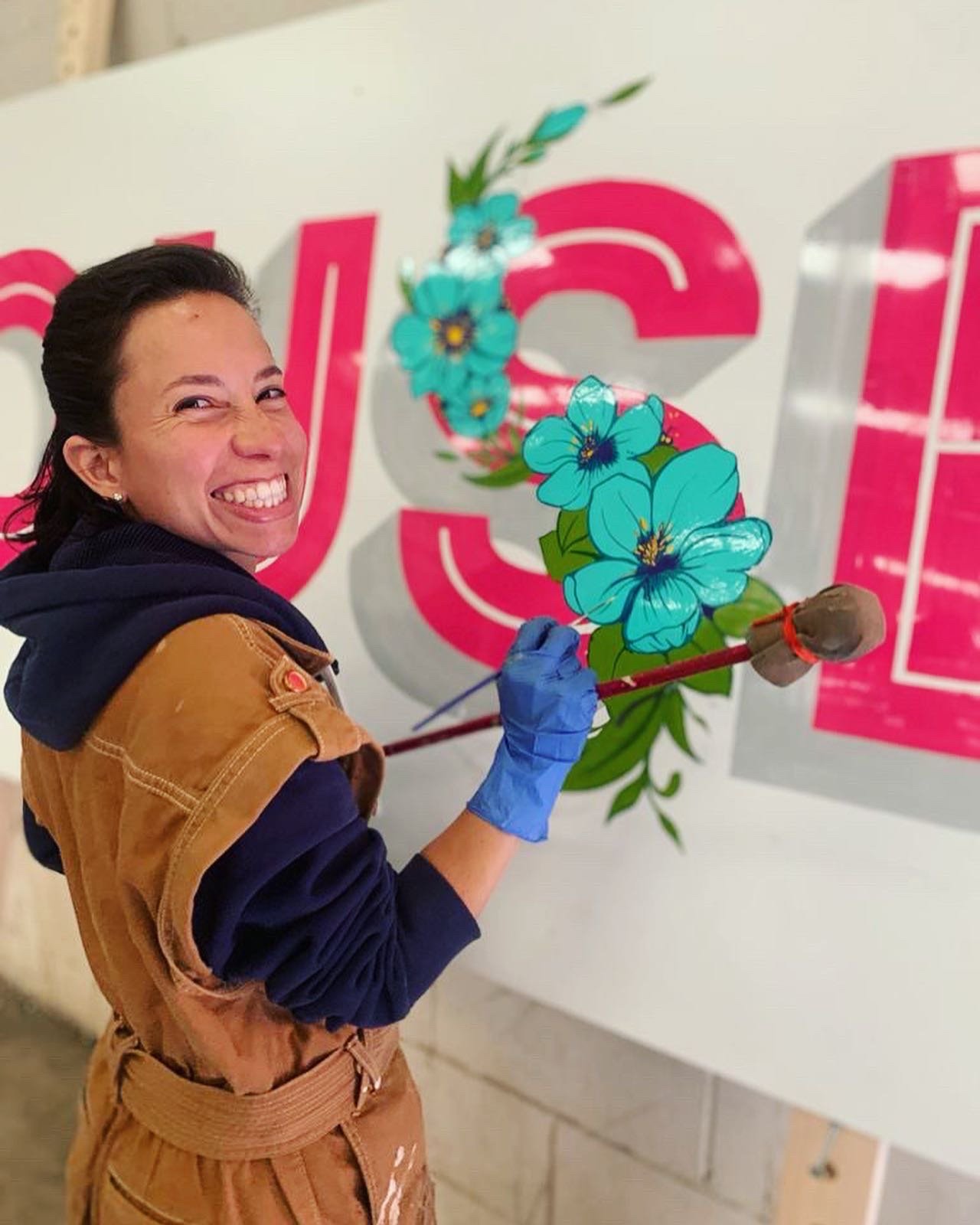
Latitude Festival, UK
This is a compilation of what it was painting a sign for the Latitude Festival. There were many hours of hard work, a lot of fumes in the air and great energy.
This sign needed to be big, easy to read and aligned with the vibes of the festival. So, I designed letters similar to the ones on their logo. Used pink as my main tone and added some flowers as a touch of art. What do you think?
What can I say, I love my job. Especially when your client is super kind, when you get the freedom to create your signs and they appreciate your work and creativity.
Thanks to Latitude Festival for the trust and opportunity to bring colours and letters to this pinky festival.
want to talk?
Send me an email or let’s have a coffee


